From the Do's and Don'ts of Web Design, provide a link to an example of a violation of number 6 (clickable elements are not obvious).
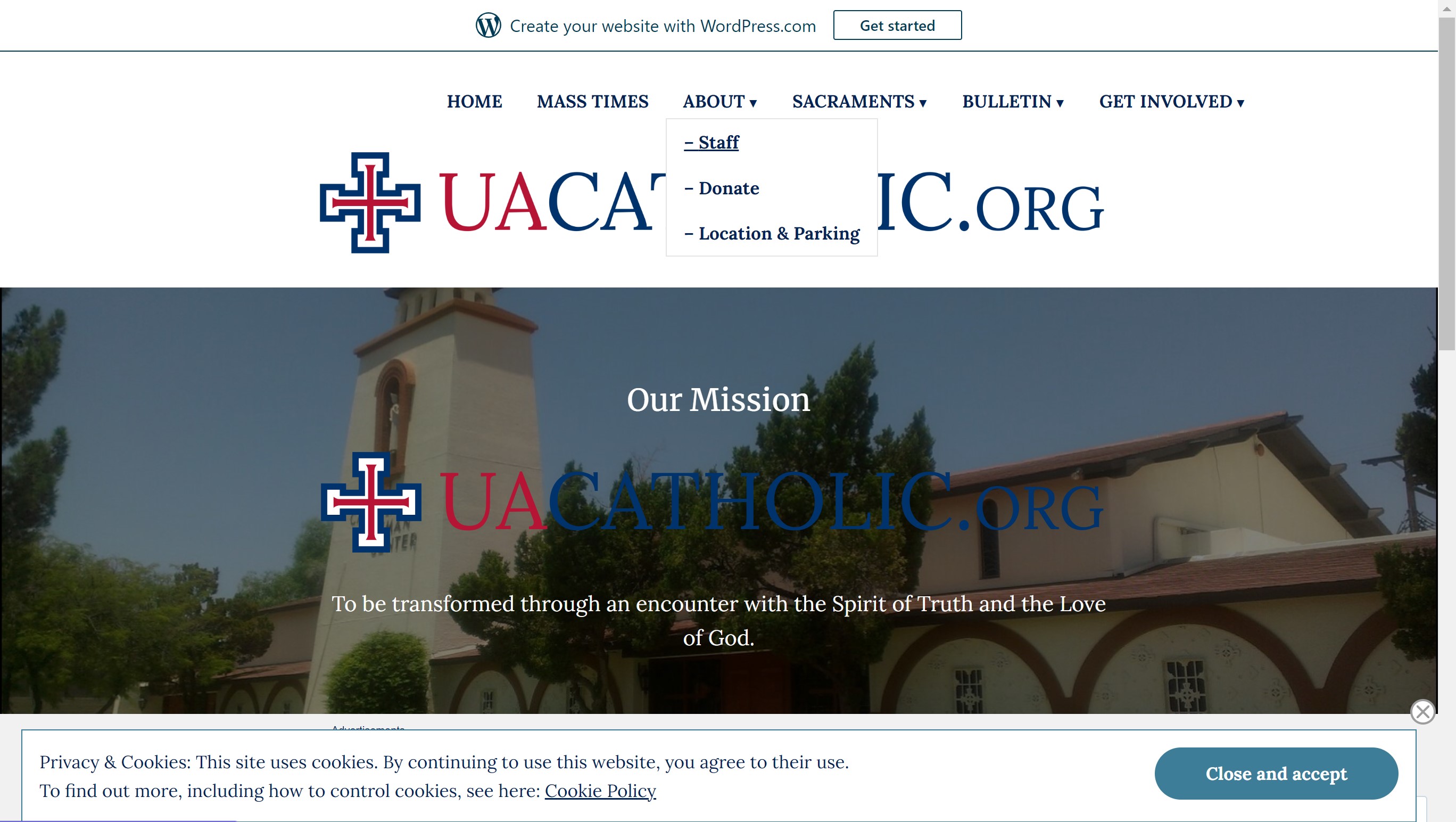
Brought to my attention by my friend who is a senior graphic design major at the University of Arizona, he has previously complained to me about how his UA Catholics website looks like it hasn't been touched since the Internet was first concieved. While since then (he showed me about a month ago), the website has been significantly updated and all the links SEEM to be fine and dandy, the real heartache comes when viewing the website on a mobile browser. When clicking on the menu button, a bulleted list appears under each category and no indication is given on whether or not the items in the list can be clicked (even though they can).
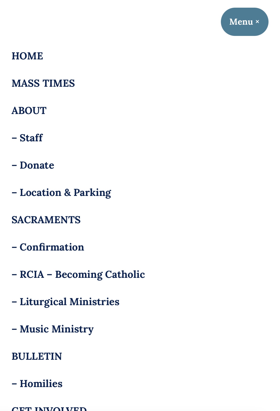
On the mobile website, it is unclear whether
there are any links to be clicked.
On the computer website, hovering over a menu item causes the word to be
underlined, indicating that the link is clickable.
From the Better User Experience Through Storytelling Articles: How can framing your project in a story format help you refine your ideas? Write a paragraph explanation.
According to Part 1 of this article, it is critical to have a user-centered goal when designing anything, not just websites. By coming up with a specific "Experience Theme" (coined and elaborated on by Cindy Chastain), it can help a team of diverse designers keep the same goal in mind when designing a product. Creating user personas is an excellent way to understand the user and is essentially creating a main character to tell a story about. Having used user personsas in past courses to understand the users of my potential app ideas, I found that it was very helpful to roleplay as a potential user instead of a designer who thinks their idea will help fill a need for other people. This helped me to focus my design more on the emotional experience rather than just building an app to complete a task.
From Meet Your Type: A Field Guide to Love and Typography: What are different ways to establish hierarchy (or emphasis) in typography design? Provide a link to a good example of hierarchy.
A great way to establish heirarchy with typography is to utilize changing up the basics like size, weight, color, style, and placement. In most cases, making one of these changes to a typeface can even eliminate the need of using another one! However, a general rule of thumb is to pair a serif and sans-serif font together. Zipl Studio's website displays a great example of creating a heirarchy with a different wieght and size of the same font.